the challenge
in with the new
Booster Juice were already aware of a number of usability issues with their website, and further research just confirmed it. Using tree-testing, we optimized their navigation and spent some time reworking the key user flows for the site, before prototyping the proposed solution. We setup bi-weekly check-ins with the client in a semi-Agile Project Management approach, reviewing work in progress and providing Booster Juice the opportunity to weigh-in and participate in the creative process.
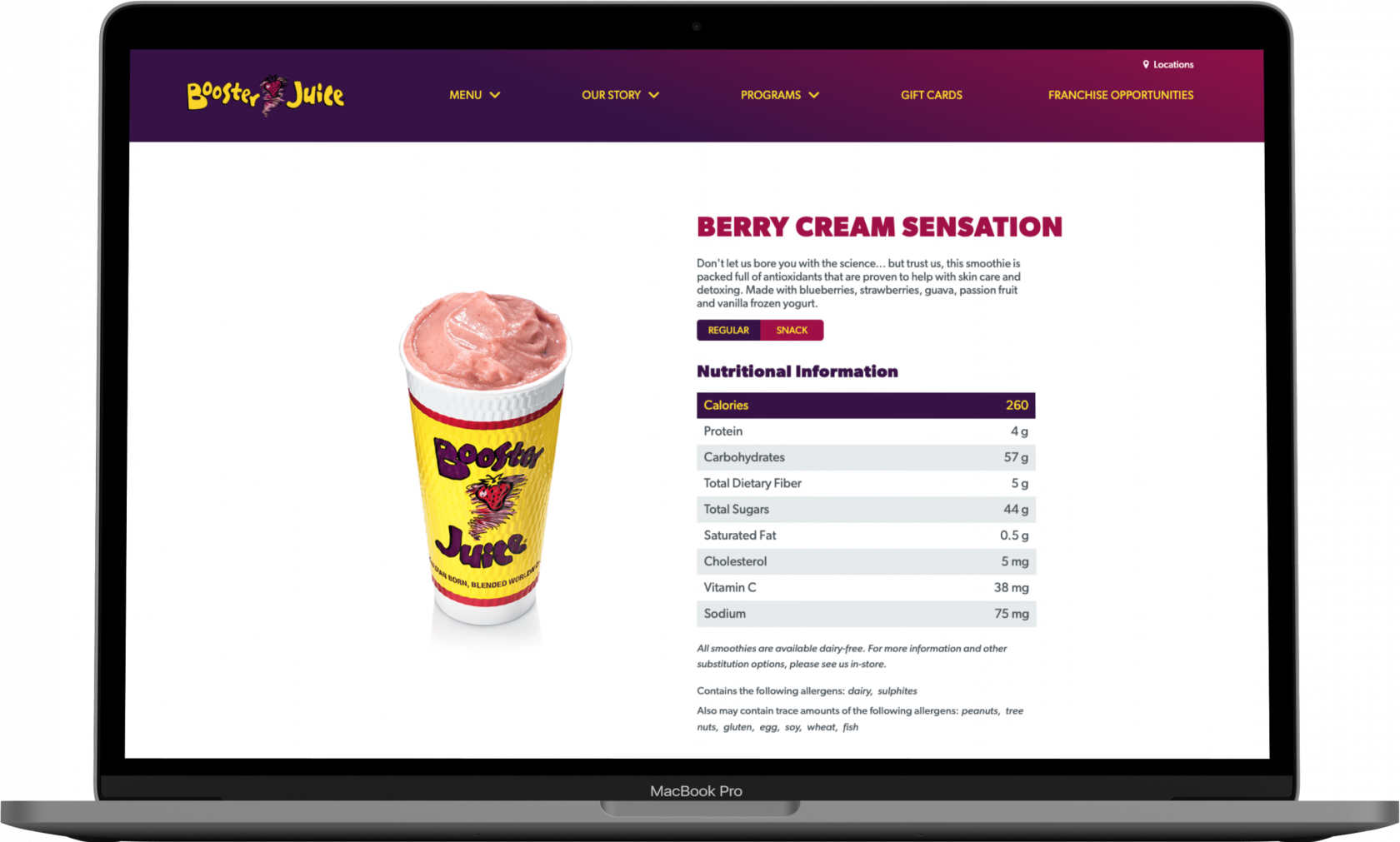
This approach was mobile first since the majority of their traffic came from mobile devices. We designed a tag-based allergen filter to allow customers to quickly filter out all products that contained selected allergens.
The previous product photography did not accurately reflect the brand or capture the vibrant colour and richness of the fresh ingredients. We reshot everything on the menu, until everyone was satisfied it conveyed what Booster Juice is known for, always fresh!


